| Property | Value | Description |
|---|
BackgroundColor | colorspec | The color to use for exposed areas of the layout background. This can be an RGB triple (e.g. [0 0 1]) or a colour name (e.g. 'b'). |
BeingDeleted | [ on | off ] | is the object in the process of being deleted. |
Callback | function_handle | Function to call when the selected tab is changed. The event-data supplied has fields PreviousChild and SelectedChild giving the previously selected and newly selected tab indices. |
Children | handle array | List of child objects within this layout (note that this can only be set to permutations of itself). |
DeleteFcn | function_handle | Function to call when the layout is being deleted |
Enable | [ on | off ] | Is interaction with this layout enabled? Note that changing the enable property will cause all children contained to also be enabled/disabled, however since they can be individually re-enabled the state of this property does not reflect the state of the children. See the enable example for more details. |
FontAngle | [ normal | italic | oblique ] | Title font angle. |
FontName | string | Title font name (e.g. Arial, Helvetica etc). |
FontSize | positive integer | Title font size. |
FontUnits | [ inches | centimeters | normalized | points | pixels ] | Title font units for measuring size. |
FontWeight | [ light | normal | demi | bold ] | Title font weight. |
ForegroundColor | colorspec | Title font color and/or color of 2-D border line. |
HighlightColor | colorspec | 3-D frame highlight color. |
ShadowColor | colorspec | 3-D frame shadow color. |
IsMinimized | logical | Is this panel in a minimized state. |
MinimizeFcn | function handle | Function to call when panel is minimized or maximized. |
Padding | positive integer | Number of pixels of extra space around the outside of the layout. |
Parent | handle | The handle of the parent figure or container. |
Position | [x y w h] | The position (x,y) and size (w,h) of the layout. |
SelectedChild | positive integer or empty | Which child is visible. |
TabSize | positive integer | Size (width) of the tabs in pixels (default 50). |
TabEnable | cell array of [ on | off ] | A list of the enabled state of each tab (default is all 'on'). |
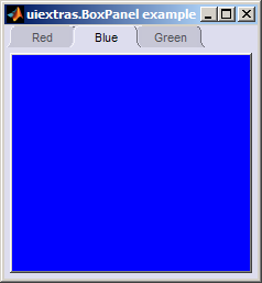
TabNames | cell array of strings | A list of the names of the tabs with one entry per tab. |
Tag | string | A string that can be used to identify this object later. |
Type | string | the object type (class). |
Units | [ inches | centimeters | normalized | points | pixels | characters ] | The units of measurement for position the layout within its parent. |
Visible | [ on | off ] | Is the object visible on screen. |